Tuesday, September 29, 2015

15.071x Analytics Edge, Optimization

Linear Optimization

Linear optimization (also called linear programming) is a method used to select optimal decisions. The key components of a linear optimization model are the decision variables, the objective, and the constraints.
The decision variables in a linear optimization model represent the choices faced by the decision maker, and can take continuous values in a range. Examples are the number of gallons of crude oil to use to produce gasoline and the intensity of beams in radiation therapy. A linear optimization model is used to find the optimal values of these decision variables.
The objective in a linear optimization model is to maximize or minimize a linear function of the decision variables. Examples are to maximize total revenue, to minimize total cost, or to minimize the amount of radiation to healthy tissue. This is the ultimate goal of the linear optimization model.
The constraints in a linear optimization model are linear equations of the decision variables that must be satisfied by the solution of the model. They often represent feasibility problems in the model; if the constraints are not met, the solution will not work. Examples are to not produce more gasoline than the demand and to make sure the tumor gets enough radiation.

Integer Optimization

Integer optimization (also called integer programming) is similar to linear optimization, but the decision variables are constrained to take integer values (...,-3,-2,-1,0,1,2,3...) or binary values (0 or 1). Examples of integer decision variables are whether or not to invest in a stock, assigning nurses to shifts, the number of new machines to purchase in a factory, and the number of items to stock in a store. The objective and constraints are the same as in linear optimization: they must be linear functions of the decision variables.

Optimization in LibreOffice and OpenOffice

Optimization models can be solved in many spreadsheet software programs, including LibreOffice and OpenOffice. Suppose we wish to solve the following very simple optimization model:

maximize: 5x+3y+2z
Constraint 1: x+y+z5
Constraint 2: zx0
Non-negativity: x0,y0,z0

This can be set up in a spreadsheet as follows:
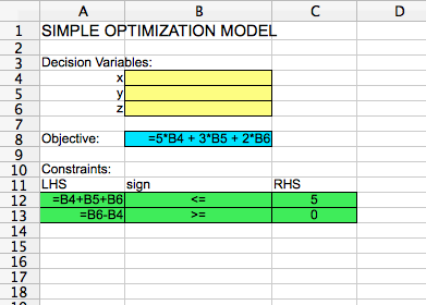
LinearOptModel
The decision variable cells are highlighted in yellow. They are blank, since the model has not been solved yet. The objective cell is highlighted in blue. It is equal to 5 times the decision variable x (in cell B4), plus 3 times the decision variable y (in cell B5), plus 2 times the decision variable z (in cell B6). The constraints are highlighted in green. They are that (1) the sum of all decision variables must be less than or equal to 5, and that (2) z - x must be greater than or equal to zero. LHS here stands for "Left-hand side" of the constraint, and "RHS" stands for "Right-hand side" of the constraint.
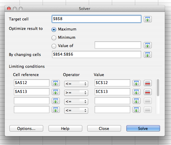
To solve this model, you can select "Solver" from the "Tools" menu. A window will pop up that looks like the following:
OptSolver
The values in "Target cell", "By changing cells", and "Limiting conditions" need to be filled in by you. The "Target cell" should be the objective cell, and the "By changing cells" should be the decision variable cells. Maximum or minimum should be selected based on whether the problem is a maximization problem or a minimization problem. In the "Limiting conditions" section, the "Cell reference" column should correspond to the cells in the LHS section of your model, the "Operator" column should correspond to the cells in the sign section of your model, and the "Value" column should correspond to the cells in the RHS section of your model.
If you select "Options..." you can check a box that says "Assume variables as non-negative". This makes it easy to make sure that all of the decision variables should have values greater than or equal to zero.
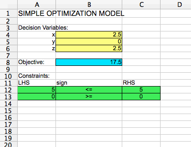
If you hit "Solve" and then "Keep Result", your spreadsheet should look like the following:
LinearOptSolution

The optimal solution is x = 2.5, y = 0, and z = 2.5, with an optimal objective function value of 17.5.
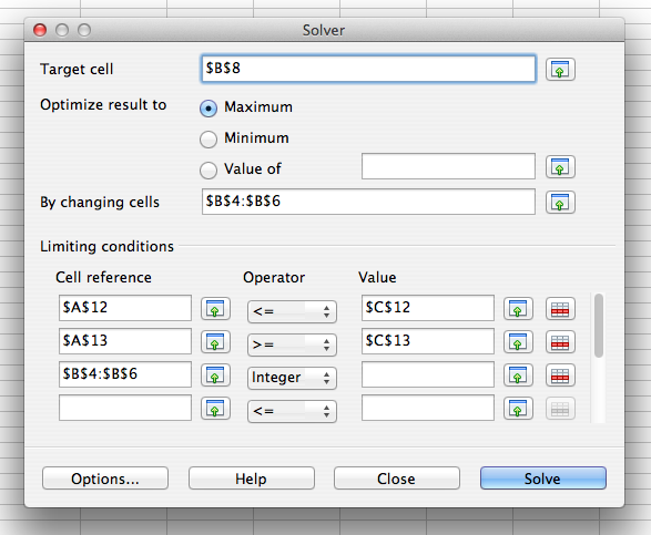
If we would like to change the model to an integer optimization model by constraining the decision variables to integer values, we can do so by opening the solver again, and adding an integer restriction to the "Limiting conditions":
OptSolver_Integer

In the operator pull-down menu, you could alternatively select "Binary" to constrain the decision variables to take binary values. You don't need to put anything in the "Value" column for an integer or binary restriction. If you hit "Solve" and then "Keep Result", you get the optimal solution x = 2, y = 1, and z = 2, with an optimal objective function value of 17.
15.071x Analytics Edge, Data Visualization

Data visualization is often useful to find hidden patterns and trends in data, to visualize and understand the results of analytical models, and to communicate analytics to the public. It is defined as a mapping of data properties to visual properties. Data properties are usually numerical or categorical, like the mean of a variable, the maximum value of a variable, or the number of observations with a certain property. Visual properties are attributes like (x, y) coordinates, colors, sizes, or shapes. Both types of properties can be useful for understanding a dataset.
There are many different visualizations that can be created to understand and interpret data. Here are some examples, which we show how to create in ggplot below:
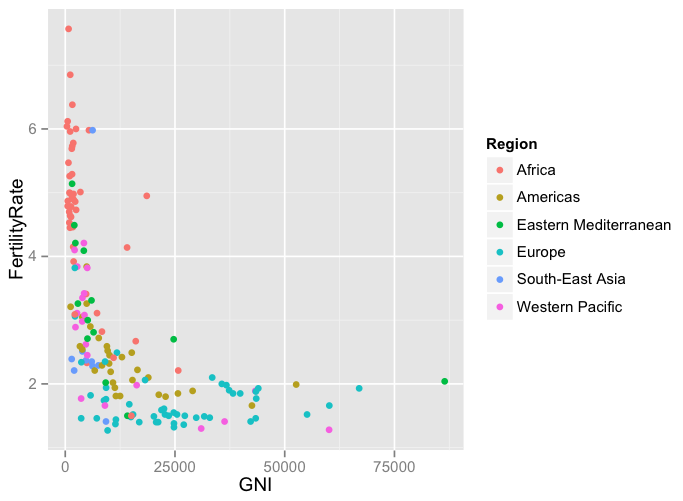
  • Scatterplots. A scatterplot can often be the cleanest and most understandable visualization. It plots data as points in two dimensions, with one variable on the x-axis and one variable on the y-axis. By changing the color, shape, or size of the points according to another variable, additional dimensions can be added. Here is an example of a scatterplot, which compares Gross National Income (GNI) to Fertility Rate for countries:
Scatterplot
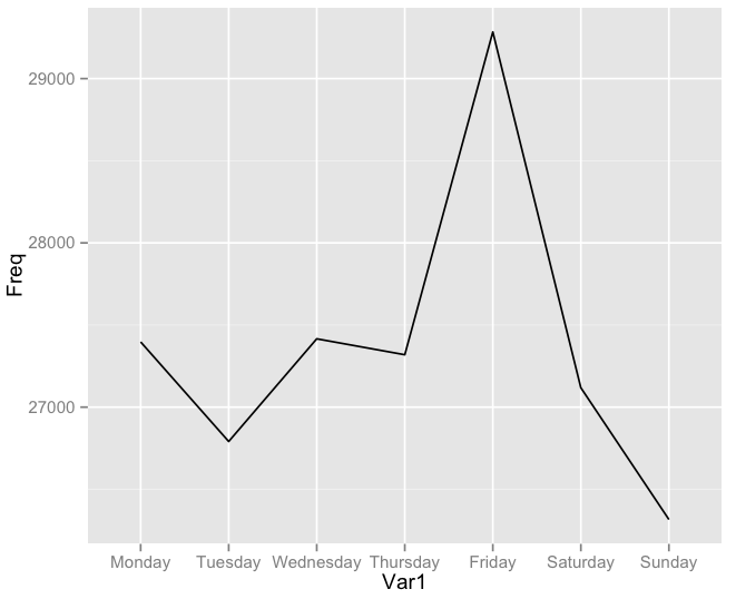
  • Line plots. A line plot is often useful for visualizing data with a time component. Like scatterplots, a line plot can show multiple dimensions by changing the color or type of the lines. For example, the following plot shows the number of motor vehicle thefts in the city of Chicago by day of the week:
Lineplot
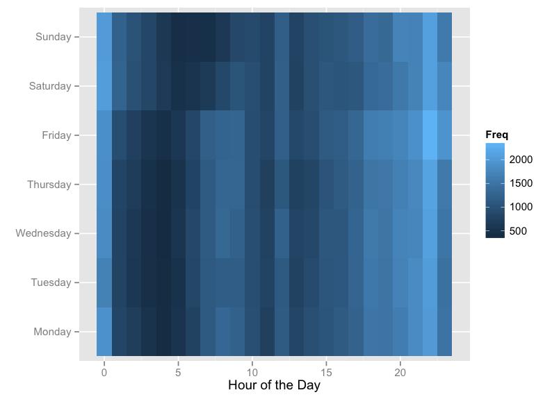
  • Heat Maps. A great way to visualize frequency data on two attributes (like the frequency of crime according to the day of the week and the hour of the day, shown in the heat map below) is by using a heat map. A heat map creates a grid in two dimensions, with one attribute on the x-axis and the other on the y-axis. There is a square in the grid for every possible pair of the two attributes. For example, in the following plot, we have 7*24 = 168 squares in the grid, one for each hour of each day. Then the squares are shaded according to the frequency attribute.
Heatmap
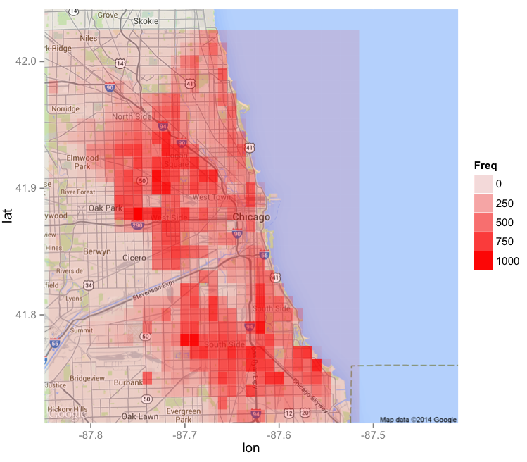
Alternatively, we could draw a heatmap on a geographical map, shown in the figure below. Here the grid attributes are longitude and latitude, and the squares in the grid are shaded according to the amount of crime in that area.
ChicagoMap
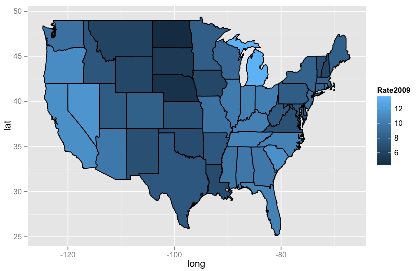
  • Geographical Maps. A common visualization used by organizations like the Centers for Disease Control (CDC) and the World Health Organization (WHO) is a country or world map, with the different states or countries colored according to some attribute, like obesity, high school graduation, or unemployment. The following visualization shows an unemployment map of the United States from 2009, during the peak of the Great Recession.
USMap

Visualizations in R

Great visualizations can be created in R using the "ggplot2" package.
Scatterplots and Line Plots. Suppose we have a data frame called "Dataset", and we want to plot the data according to the attributes "Variable1" and "Variable2". We can make a basic scatterplot with the following command:

ggplot(Dataset, aes(x = Variable1, y = Variable2)) + geom_point()

We can uniformly change the color, shape, and size of the points by adding arguments to geom_point, and add a title to the plot by adding ggtitle:

ggplot(Dataset, aes(x = Variable1, y = Variable2)) + geom_point(color="blue", shape=17, size=2)
ggplot(Dataset, aes(x = Variable1, y = Variable2)) + geom_point(color="darkred", shape=8, size=5) + ggtitle("Our Basic Scatterplot")
Or we can color the points by a third attribute "Variable3" by adding a color argument to the ggplot aesthetic:

ggplot(Dataset, aes(x = Variable1, y = Variable2, color = Variable3)) + geom_point()

Alternatively, we can create a line plot with the following command:

ggplot(Dataset, aes(x = Variable1, y = Variable2)) + geom_line()

Heat maps. Now suppose we want to create a heat map with the attributes "Variable1" and "Variable2" defining the grid, and then shade it according to the variable "Frequency". We can do this with the following command:

ggplot(Dataset, aes(x = Variable1, y = Variable2)) + geom_tile(aes(fill = Frequency))

We can change the color scheme to range from white to red with the following command:

ggplot(Dataset, aes(x = Variable1, y = Variable2)) + geom_tile(aes(fill = Frequency)) + scale_fill_gradient(low="white", high="red")

To create a heat map on the map of a city, we can use the "maps" and "ggmap" packages. The following commands create a red heat map on a map of Chicago, assuming that we have a dataset called "Dataset" with variables "Longitude", "Latitude" and "Counts":

chicago = get_map(location = "chicago", zoom = 11)
ggmap(chicago) + geom_tile(data = Dataset, aes(x = Longitude, y = Latitude, alpha = Counts), fill="red")

United States map. To create a map of the United States with the states colored according to some attribute, we can use the following commands. Here we are assuming that our dataset is called "Dataset", it contains a variable called "region" with the names of the states in lowercase letters, and we want to color the states by "Variable1".

statesMap = map_data("state")
MergedData = merge(statesMap, Dataset, by="region")
ggplot(MergedData, aes(x = long, y = lat, group = group, fill = Variable1)) + geom_polygon(color = "black")

If we want to change the color scheme to range from white to red, we can do that with the following ggplot command:

ggplot(MergedData, aes(x = long, y = lat, group = group, fill = Variable1)) + geom_polygon(color = "black") + scale_fill_gradient(low = "white", high = "red")

15.071x Analytics Edge, Clustering

Clustering is an unsupervised learning method, meaning that clustering is not used to predict an outcome, or dependent variable. The main goal is to segment a set of observations into similar groups, based on the available data. However, although clustering is not designed to predict anything, clustering can be useful
  • to improve the accuracy of predictive models,
  • as a stand-alone tool to get insight into data distribution,
  • as a preprocessing (or intermediate) step for other algorithms
The data can be clustered into similar groups, which may add structure to the input data, e.g. in the form of new derived attributes. Clusters can also be used to build a predictive model for each group. We saw an example of this in the Patterns of Heart Attacks lecture.
Before a clustering algorithm can be applied, the distance metric that will be used to define the distance between two points needs to be selected. A typical choice is euclidean distance. This is discussed more in relation to the specific clustering algorithms below. Additionally, the data often needs to be normalized, to make sure that some variables will not dominate others in the distance calculation. This can be done by subtracting the mean and dividing by the standard deviation for each variable.
There are many different algorithms for clustering, which differ in how the clusters are built and the properties of the clusters produced from the method. In this class, we cover Hierarchical clustering and K-means clustering, two of the most popular clustering methods.

Hierarchical Clustering

Hierarchical clustering starts with each observation in its own cluster. So if you have n data points, or observations, you start with n clusters. Then the distance between each pair of clusters (or points) is computed, and the two closest clusters are combined (resulting in n-1 clusters). This is repeated until all of the data points are in a single cluster.
There are many different ways to define point distance and cluster distance in hierarchical clustering. A common point distance is euclidean distance, and a common cluster distance is centroid distance.
Hierarchical clustering can be visualized with a dendrogram. In a dendrogram, each of the points is shown on the bottom, and the process by which they are combined is shown with lines in the plot. The height of the lines approximately shows how far apart the two clusters were when they were combined.
Hierarchical clustering is done without first selecting the number of clusters desired. This is nice because you can run the algorithm without having to know the appropriate number of clusters for your problem. However, in many applications, you need to ultimately have a specific number of clusters. This can be done after the hierarchical process is complete by looking at the dendrogram. You should imagine a horizontal line cutting across the dendrogram. The number of vertical lines of the dendrogram that your horizontal line crosses shows how many clusters would be selected. That number of clusters tends to be a good choice if the horizontal line has a lot of "wiggle room", meaning that the horizontal line can move up and down without running into a horizontal line of the dendrogram. However, when picking the number of clusters for a particular problem, you should also consider how many clusters make sense for the particular application.

K-Means Clustering

Instead of forming the clusters in a hierarchical way, k-means clustering iteratively re-assigns data points to clusters. First, the number of clusters desired has to be selected. It is often useful to run hierarchical clustering first to better understand which number of clusters would be good, or to think about the number of clusters that would be appropriate for the given problem. You can also run the clustering several times with a different choices for the number of clusters. The results can be visualized with a scree plot, which plots the number of clusters along the x-axis, and the sum of squares within each cluster (or another variance metric) on the y-axis. This shows for different choices of the number of clusters how much variance there is within the clusters. There is often an "elbow" in the line, which indicates a good choice for the number of clusters.
Once the number of clusters has been selected, each data point is randomly assigned to one of the clusters and each cluster centroid is computed. Then each data point is re-assigned to the closest cluster centroid, and the cluster centroids are re-computed. This process repeats until no improvement can be made, or no data point needs to be re-assigned. It can also be stopped by defining a maximum number of iterations.
The largest benefit of the k-means clustering algorithm is that it is very fast, and works with small and large datasets. This is not true for hierarchical clustering, because of the distance computations required for hierarchical clustering. Hierarchical clustering will not work if the dataset is too large, so in some situations, hierarchical clustering might not be an option.
Regardless of the clustering algorithm you use, you should always analyze and explore your resulting clusters to see if they are meaningful. This can be done by looking at basic statistics in each cluster, like the mean, minimum, and maximum values in each cluster and each variable. You can also check to see if the clusters have a feature in common that was not used in the cluster, like an outcome variable. If they do, then this often indicates that your clusters might help improve a predictive model.

Clustering in R

Suppose your dataset is called "DataFrame", which consists of the following three independent variables: "IndependentVar1", "IndependentVar2", and "IndependentVar3".
These variables can be normalized using the "caret" package and the following commands:

preproc = preProcess(DataFrame)
DataFrameNorm = predict(preproc, DataFrame)

Then the normalized dataset is called DataFrameNorm, which we will use for clustering.
Then you can construct a hierarchical clustering model based on these three variables with the following commands:

HierDistances = dist(DataFrameNorm, method = "euclidean")
HierClustering = hclust(HierDistances, method = "ward.D")

We used euclidean distance for the points, and Ward's method for the clustering, but other methods can be used as well. You can plot the cluster dendrogram using the plot function:

plot(HierClustering)

Once you have decided on a number of clusters to use (we'll use five clusters here), you can assign observations to cluster groups using the cutree function:

HierClusterGroups = cutree(HierClustering, k = 5)

And then using these assignments, you can analyze the cluster centroids using the tapply function:

tapply(DataFrameNorm$IndependentVar1, HierClusterGroups, mean)
tapply(DataFrameNorm$IndependentVar2, HierClusterGroups, mean)
tapply(DataFrameNorm$IndependentVar3, HierClusterGroups, mean)

Or, you can analyze the cluster centroids with the following more advanced single command:

lapply(split(DataFrameNorm, HierClusterGroups), summary)

To create a k-means clustering model, you can use the kmeans function (we'll create five clusters):

KMeansClustering = kmeans(DataFrameNorm, centers = 5)

Then the assignment of observations to cluster groups is an attribute of the KMeansClustering object:

KMeansClusterGroups = KMeansClustering$cluster

And then just like for hierarchical clustering, you can analyze the cluster centroids using the tapply function:

tapply(DataFrameNorm$IndependentVar1, KMeansClusterGroups, mean)
tapply(DataFrameNorm$IndependentVar2, KMeansClusterGroups, mean)
tapply(DataFrameNorm$IndependentVar3, KMeansClusterGroups, mean)

15.071x Analytics Edge, Text Analytics

Text analytics is a set of techniques that model and structure the information content of textual sources, which are frequently loosely structured and complex. The ultimate goal is to convert text into data for analysis.
One popular and commonly-used text analytics technique is called "bag of words". While fully understanding text is difficult, this approach does something much simpler: it just counts the number of times each word appears in the text. So ultimately, you end up with one feature for each word.
This approach is often very effective, and it can be dramatically improved by pre-processing the text. Text data has many inconsistencies that can cause algorithms trouble. Some common initial pre-processing steps are to convert all of the letters to lowercase and to remove punctuation. This makes sure that "analytics", "AnALYticS", "Analytics!", and "#analytics" are all considered the same word.
More advanced pre-processing techniques include the removal of stop words and stemming the words. Stop words are words like "the", "at", "is", and "which". These words are frequently used, but are not typically meaningful in a particular sentence. Since they are unlikely to improve the quality of an analytics model, they are removed to clean up the dataset. Stemming words means representing different forms of the same words by a common stem. An example is representing "argue", "argued", "argues" and "arguing" by the common stem "argu". It typically does not matter which form of the word is used, so by combining words with common stems analytics models can often be improved. There are several ways to approach the problem of stemming, including building a database of words and their stems, and writing a rule-based algorithm.

Text Analytics in R

To use text analytics in R, we'll use the package "tm". For other packages see this page on CRAN. Suppose your dataset is called "DataFrame", and the text field for which you would like to use the bag of words approach is called "Text".
First, we need to create a corpus of our text field:
TextCorpus = Corpus(VectorSource(DataFrame$Text))
Then, we need to pre-process the text. We'll convert all letters to lowercase, remove punctuation, remove stopwords, and stem the words. The second line of code is due to a recent change in the "tm" package, and needs to be run if you are using the latest version of tm.

TextCorpus = tm_map(TextCorpus, tolower)
TextCorpus = tm_map(TextCorpus, PlainTextDocument)
TextCorpus = tm_map(TextCorpus, removePunctuation)
TextCorpus = tm_map(TextCorpus, removeWords, stopwords("english"))
TextCorpus = tm_map(TextCorpus, stemDocument, language="english")
 
Now, we will create the bag of words matrix of frequencies:

FrequencyMatrix = DocumentTermMatrix(TextCorpus)
 
If desired, we can create a sparse matrix, by removing words that occur very rarely:

SparseMatrix = removeSparseTerms(FrequencyMatrix, 0.95)
SparseMatrix = removeSparseTerms(FrequencyMatrix, 0.99)
 
The first line only keeps words that appear in 5% or more of the observations, and the second line keeps words that appear in 1% or more of the observations (the closer the second argument is to 1, the more words will be in the resulting matrix).
Lastly, we can convert our matrix to a data frame, and make sure all of the variable names (words) are "R-friendly":

NewDataFrame = as.data.frame(as.matrix(SparseMatrix))
colnames(NewDataFrame) = make.names(colnames(NewDataFrame))

Now, you can add a dependent variable back into this data frame to build a predictive model using the words in the text.
Interesting info from the last (optional) homework in the Text Analytics module:
USING N-GRAMS
Another source of information that might be extracted from text is the frequency of various n-grams. An n-gram is a sequence of n consecutive words in the document. For instance, for the document "Text analytics rocks!", which we would preprocess to "text analyt rock", the 1-grams are "text", "analyt", and "rock", the 2-grams are "text analyt" and "analyt rock", and the only 3-gram is "text analyt rock". n-grams are order-specific, meaning the 2-grams "text analyt" and "analyt text" are considered two separate n-grams. We can see that so far our analysis has been extracting only 1-grams.
We do not have exercises in this class covering n-grams, but if you are interested in learning more, the "RTextTools", "tau", "RWeka", and "textcat" packages in R are all good resources.
Corpus Preprocessing function

tm_pre_process <- function(data){
        library(tm)
        corpusTitle = Corpus(VectorSource(data))
        corpusTitle = tm_map(corpusTitle, tolower)
        corpusTitle = tm_map(corpusTitle, PlainTextDocument)
        corpusTitle = tm_map(corpusTitle, removePunctuation)
        corpusTitle = tm_map(corpusTitle, removeWords, stopwords("english"))
        corpusTitle = tm_map(corpusTitle, stemDocument)
        corpusTitle
}
 
Function can be loaded directly into R. Then can be re used for doing repetitive pre-processing.
For an example

corpus = tm_pre_process(data)

15.071x Analytics Edge, CART and Random Forests

Classification and regression trees (CART) and random forests are both tree-based methods. Trees are flexible data-driven methods to determine an outcome using splits, or logical rules, on the independent variables. Trees have the ability to more easily capture nonlinear relationships than linear and logistic regression, and can be used for both a continuous outcome (like in linear regression) and a categorical outcome (like in logistic regression).

CART

The simpler of the two methods is CART. In a CART model, a single tree is constructed, and for this reason, CART models are very easy to interpret. It is a popular model in applications where the method needs to be easy to explain. This interpretability and the ability to capture nonlinearities in the data are two major benefits of CART.
Each split in a CART tree is always based on only one independent variable, and a CART tree can be given as many independent variables as you have available. If a particular independent variable is not a good predictor of the dependent variable, the CART tree will not use that variable at all to make a split. For this reason, a CART tree is often useful to help find the important variables when you have tens, or even hundreds, of independent variables available.
The splits used in a CART model divide the observations into smaller groups, called leaves or buckets. These groups are selected to be as homogenous or "pure" as possible, meaning that we want each of the groups to contain observations belonging to just one class. This is not always possible, since we might have two observations with exactly the same values of the independent variables, but belonging to different classes.
Even if it is possible to divide the observations into pure groups, it is typically not a good idea. It leads to overfitting of the training data, and the model will not extend well to data that it has never seen before. One popular method to prevent overfitting from happening is to set a minimum number of observations that must be in each final group of the tree. The choice of this parameter can often influence the accuracy of the model, and several different parameter choices should be tested. One way of doing this is with a technique called cross-validation.
For each bucket or leaf of the tree, the typical prediction is to predict the majority outcome of all of the observations in the training set that belong in that bucket. We can instead assign a probability to each observation of belonging to each class by computing the percentage of observations in the corresponding bucket that belong to that class. Then these probabilities can be thresholded to capture different error preferences, similarly to logistic regression (note that predicting the majority outcome is like using a threshold of 0.5).
CART can easily be used to predict an outcome with more than two classes, or a continuous outcome. With a continuous outcome, the prediction for each group is the average value of the dependent variable over all training points that were classified into that group. In a CART model, regardless of the outcome type, keep in mind that all observations that are classified into the same group, or bucket, will have the same prediction.
After building a cart model, a couple of steps should be taken to assess the validity and evaluate the performance of the tree:
  • Plot the tree and look at each of the decision rules. Check to see if they make sense intuitively. Rules that seem strange could still be accurate, or it could be a sign that the data needs to be examined. This is also a good way to see which variables are the most important for the model, by seeing which ones were used in the tree.
  • Assess the accuracy of the tree on a test set. The predictions should be compared to the actual values by using a classification matrix (for a categorical outcome) or by computing the R2 value (for a continuous outcome).

Random Forests

The method of random forests was designed to improve the prediction accuracy of CART. It works by building a large number of CART trees which each "vote" on the outcome to make a final prediction. Unfortunately, this makes the method less interpretable than CART, so often you need to decide which you value more: the interpretability of the model, or attaining the maximum possible accuracy.
In a random forest, each tree is given a random subset of the independent variables from which it can select the splits, and a training set that is a bagged or bootstrapped sample of the full dataset. This means that the data used as the training data for each tree is selected randomly with replacement from the full dataset. As an example, if we have five data points in our training set, labeled {1,2,3,4,5} we might use the five observations {3,2,4,3,1} to build the first tree, the five observations {5,1,3,3,2} to build the second tree, etc. Notice that some observations are repeated, and some are not included in certain training sets. This gives each tree a slightly different training set with which to build the tree, and helps make the trees see different things in the data.
Just like in CART, there are some parameters that need to be selected for a random forest model. However, random forest models have been shown to be less sensitive to the parameters of the model, so as long as the parameters are set to reasonable values, the tree is most likely close to the optimal model.

Trees in R

We will use the packages "rpart", "rpart.plot" and "randomForest" to build tree models.
Suppose your training data set is called "TrainingData", your dependent variable is called "DependentVar", and you have two independent variables called "IndependentVar1" and "IndependentVar2". If your dependent variable is categorical or binary, you can build a CART model with the following command:

CartModel = rpart(DependentVar ~ IndependentVar1 + IndependentVar2, data=TrainingData, method="class", minbucket=25)
 
The value selected for minbucket can be any number you choose, or a value selected through cross-validation. You can also instead set a value for the "cp" parameter in a similar way. If your dependent variable is continuous, you just need to remove the method="class" argument.
You can plot the tree with the prp() function:

prp(CartModel)

Suppose your test set is called "TestingData". You can make predictions on the test set using the predict() function:

TestPredictions = predict(CartModel, newdata=TestingData, type="class")

If you have a continuous dependent variable or you want probability predictions, you should remove the type="class" argument.
If you have a classification problem, you can generate an ROC curve for your model with the following commands:
 
TestProbabilities = predict(CartModel, newdata=TestingData)
PredROC = prediction(TestProbabilities[,2], TestingData$DependentVar)
PerfROC = performance(PredROC, "tpr", "fpr")
plot(PerfROC)

To build a random forest model, you can use the following command:
 
ForestModel = randomForest(DependentVar ~ IndependentVar1 + IndependentVar2, data=TrainingData)

Be sure your outcome variable is a factor variable if you have a classification problem, which can be done with the following command:

TrainingData$DependentVar = as.factor(TrainingData$DependentVar)
 
You can also change the parameter settings of the model by adding additional arguments. For example, you can use the following command to build a random forest model with 200 trees and at least 25 observations in each bucket:

ForestModel = randomForest(DependentVar ~ IndependentVar1 + IndependentVar2, data=TrainingData, ntree=200, nodesize=25)
 
You can make predictions on your test set with the following command:

TestPredictions = predict(ForestModel, newdata=TestingData)

15.071x Analytics Edge, Logistic Regression

The Method

Logistic regression extends the idea of linear regression to cases where the dependent variable, y, only has two possible outcomes, called classes. Examples of dependent variables that could be used with logistic regression are predicting whether a new business will succeed or fail, predicting the approval or disapproval of a loan, and predicting whether a stock will increase or decrease in value. These are all called classification problems, since the goal is to figure out which class each observation belongs to.
Similar to linear regression, logistic regression uses a set of independent variables to make predictions, but instead of predicting a continuous value for the dependent variable, it instead predicts the probability of each of the possible outcomes, or classes.
Logistic regression consists of two steps. The first step is to compute the probability that an observation belongs to class 1, using the Logistic Response Function: 
 
P(y=1)=11+e(β0+β1x1+β2x2++βkxk)
 
The coefficients, or β values, are selected to maximize the likelihood of predicting a high probability for observations actually belonging to class 1, and predicting a low probability for observations actually belonging to class 0. In the second step of logistic regression, a threshold value is used to classify each observation into one of the classes. A common choice is 0.5, meaning that if P(y=1)0.5, the observation is classified into class 1, and if P(y=1)<0.5, the observation is classified into class 0. Simply stated, each observation is classified into the class with the highest probability.
However, other threshold values can be chosen, and in some cases are more appropriate. The threshold value that should be selected often depends on error preferences. When the probabilities are converted into class predictions, two types of errors can be made: false positives, and false negatives. A false positive error is made when the model predicts class 1, but the observation actually belongs to class 0. A false negative error is made when the model predicts class 0, but the observation actually belongs to class 1. If a higher threshold value is selected, more false negative errors will be made. If a lower threshold value is selected, more false positive errors will be made.
One application where decision-makers often have an error preference is in disease prediction. Suppose you built a model to predict whether or not someone will develop heart disease in the next 10 years (like the model we saw in the Framingham Heart Study lecture). We will consider class 1 to be the outcome in which the person does develop heart disease, and class 0 the outcome in which the person does not develop heart disease. If you pick a high threshold, you will tend to make more false negative errors, which means that you predicted that the person would not develop heart disease, but they actually did. If you pick a lower threshold, you will tend to make more false positive errors, which means that you predicted they would develop heart disease, but they actually did not. In this case, a false positive error is often preferred. Unnecessary resources might be spent treating a patient who did not need to worry, but you did not let as many patients go untreated (which is what a false negative error does).
Now, let's consider spam filters. Almost every email provider has a built in spam filter that tries to detect whether or not an email message is spam. Let's classify spam messages as class 1 and non-spam messages as class 0. Then if we build a logistic regression model to predict spam, we will probably want to select a high threshold. Why? In this case, a false positive error means that we predicted a message was spam, and sent it to the spam folder, when it actually was not spam. We might have just sent an important email to the junk folder! On the other hand, a false negative error means that we predicted a message was not spam, when it actually was. This creates a slight annoyance for the user (since they have to delete the message from the inbox themselves) but at least an important message was not missed.
This error trade-off can be formalized with a Confusion Matrix or a Receiver Operator Characteristic Curve (ROC curve). A confusion matrix compares predicted classes with actual classes for a particular threshold value, while an ROC curve plots the false positive rate versus the true positive rate for all possible threshold values. The ROC curve motivates an important metric for classification problems: the AUC, or Area Under the Curve. The AUC of a model gives the area under the ROC curve, and is a number between 0 and 1. The higher the AUC, the more area under the ROC curve, and the better the model. The AUC of a model can be interpreted as the model's ability to distinguish between the two different classes. If the model were handed two random observations from the dataset, one belonging to one class and one belonging to the other class, the AUC gives the proportion of the time when the observation from class 1 has a higher predicted probability of being in class 1. If you were to just guess which observation was which, this would be an AUC of 0.5. So a model with an AUC greater than 0.5 is doing something smarter than just guessing, but we want the AUC of a model to be as close to 1 as possible.

Logistic Regression in R

Suppose the training data for your model is in a data frame called "TrainingData", consisting of your dependent variable "DependentVar", and your two independent variables "IndependentVar1" and "IndependentVar2". (If you just have one dataset, you can randomly split your data frame into a training set and testing set with the sample.split function.) Then you can build a logistic regression model with the following command:

LogModel = glm(DependentVar ~ IndependentVar1 + IndependentVar2, data=TrainingData, family=binomial)

You can see the coefficients and other information about the model with the summary function:

summary(LogModel)

You can then create a vector of predictions for the training set and generate different confusion matrices with the predict() and table() functions:

TrainPredictions = predict(LogModel, type="response")
table(TrainingData$DependentVar, TrainPredictions >= 0.5)
table(TrainingData$DependentVar, TrainPredictions >= 0.3)

You can generate an ROC curve with the following commands (you first need to install and load the "ROCR" package):

ROC.Pred = prediction(TrainPredictions, TrainingData$DependentVar)
ROC.Perf = performance(ROC.Pred, "tpr", "fpr")
plot(ROC.Perf)
 
To add threshold labels and colors, replace the plot command with the following:

plot(ROC.Perf, colorize=TRUE, print.cutoffs.at=seq(0,1,by=0.1), text.adj=c(-0.2,1.7))

The AUC of the model can be computed with the following command:
 
as.numeric(performance(ROC.Pred, "auc")@y.values)

To make predictions on a test set called "TestData", you can use the predict() function:
 
TestPredictions = predict(LogModel, newdata=TestData, type="response")

You can then create confusion matrices, an ROC curve, and compute the AUC just like we did for the training set on the test set.

15.071x Analytics Edge, Linear Regression

The Method

Linear regression is used to determine how an outcome variable, called the dependent variable, linearly depends on a set of known variables, called the independent variables. The dependent variable is typically denoted by y and the independent variables are denoted by x1,x2,xk, where k is the number of different independent variables. We are interested in finding the best possible coefficients β0,β1,β2,βk such that our predicted values:
y^=β0+β1x1+β2x2++βkxk
are as close as possible to the actual y values. This is achieved by minimizing the sum of the squared differences between the actual values, y, and the predictions y^. These differences, (yy^), are often called error terms or residuals. Once you have constructed a linear regression model, it is important to evaluate the model by going through the following steps:
  • Check the significance of the coefficients, and remove insignificant independent variables if desired.
  • Check the R2 value of the model.
  • Check the predictive ability of the model on out-of-sample data.
  • Check for multicollinearity.

Linear Regression in R

Suppose your training data frame is called "TrainingData", your dependent variable is called "DependentVar", and you have two independent variables, called "IndependentVar1" and "IndependentVar2". Then you can build a linear regression model in R called "RegModel" with the following command:

RegModel = lm(DependentVar ~ IndependentVar1 + IndependentVar2, data = TrainingData)
 
To see the R2 of the model, the coefficients, and the significance of the coefficients, you can use the summary function:

summary(RegModel)
 
To check for multicollinearity, correlations can be computed with the cor() function:

cor(TrainingData$IndependentVar1, TrainingData$IndependentVar2)
cor(TrainingData)
 
If your out-of-sample data, or test set, is called "TestData", you can compute test set predictions and the test set R2 with the following commands:

TestPredictions = predict(RegModel, newdata=TestData)
SSE = sum((TestData$DependentVar - TestPredictions)^2)
SST = sum((TestData$DependentVar - mean(TrainingData$DependentVar))^2)
Rsquared = 1 - SSE/SST

In nutshell- Rsquared does three way comparision. SSE : Test data with respect to prediction from model, SST :Test data with respect of training data.   

Tips and Tricks

Quick tip on getting linear regression predictions in R posted by HamsterHuey (this post is about Unit 2 / Unit 2, Lecture 1, Video 4: Linear Regression in R)
Suppose you have a linear regression model in R as shown in the lectures:

RunsReg = lm(RS ~ OBP + SLG, data=moneyball)
 
Then, if you need to calculate the predicted Runs scored for a single entity with (for example) OBP = 0.4, SLG = 0.5, you can easily calculate it as follows:

predict(RunsReg, data.frame(OBP=0.4, SLG=0.5))
 
For a sequence of players/teams you can do the following:

predict(RunsReg, data.frame(OBP=c(0.4, 0.45, 0.5), SLG=c(0.5, 0.45, 0.4)))
 
Sure beats having to manually extract coefficients and then calculate the predicted value each time (although it is important to understand the underlying form of the linear regression equation.